


 |
| The majority of our audience were in the 16 to 25 year old age bracket. This tells us that we have effectively targeted the audience that we were aiming for. |
- Our audience uses music for escapism, entertainment, for companionship while travelling and as a shared experience at parties/gatherings
- Consume music via streaming sites such as Spotify, through iTunes, YouTube (prosumers)
- Use smartphones, computers/laptops to consume the music
- Enjoy going to gigs, being part of a fanbase/community
 |
- Fans of the indie/indie-pop genre, artists such as San Cisco
- Enjoy independent films such as Kill Your Darlings and Struck By Lightning, as well as classic pop culture films like Pulp Fiction.
- Like TV shows such as Friends and In The Flesh
I feel that our texts can also target the younger, 11 to 15 year old audiences as well though, especially females, as we chose to include the stereotypical 'attractive lead singer', which is conventional for bands to do, i.e. Brendon Urie from Panic! At The Disco. This appeal would stretch to females of all ages, but particularly at the younger age, when people are discovering their own music tastes, there would be an appeal.
 |
| Brendon Urie from P!ATD |
While creating our texts, we paid attention to Blumler and Katz's Uses and Gratifications theory, including elements of Diversion, Personal Relationships, Personal Identity and Surveillance across the three text, focusing on Diversion, Personal Relationships and Personal Identity.
Diversion:
In order to make all of our texts quite fun and quirky, we used bright colours and a stylistic font that connoted the genre.
 |
| An image showing the way colour is used in all three of our texts |
We included interactivity in our website to improve the entertainment of the text, ensuring that the audience has sufficient content to look through and enjoy, i.e. the Blooper reel and Behind-the-scenes gallery.
As a form of escapism, we included different eras and settings in our video than those the audience would encounter daily, so that while watching our video or interacting with any of our texts, they would feel a sense of escape from daily routines and problems.
Personal Relationships:
 |
| We used phrases like 'Hey guys' on our social media to directly address the audience. |
We also created social media pages for our band, to allow the audience to interact with our band directly. The messages we wrote on our Facebook pages were inclusive of the audience, addressing them directly by using 'You' in the messages. This helps to build the relationship experienced by the audience members with the band.
They were also able to send the band messages via our website, allowing them to begin to build personal relationships by interacting/conversing with the band members. (Below)
 |
| We created a 'send a message' option to our website |
Personal Identity:
The main way in which we tried to do this is via the music video, which included the modern era scene, making it more relatable to the the audience.
Also, our band's clean cut image is maintained across all three of our texts, with no sexualisation of any of the band members (while still allowing for voyeuristic pleasure with the ECUs of Jacob), which would be aspirational to younger members of the audience who are trying to discover who they are, and also likeable for the parents, as they would see that our band are innocent but quite fun.
 |
| On the About page of our website, Jacob is portrayed as quite cute and innocent, with the image being very bright, and the costume also further connoting this image. This would be good for both young audiences, and the 16 to 25 year old audience, who could relate to/like the innocence of his character, and also the quirkiness of his interview. |
We expected our music video's appeal to be skewed towards the female audience as well, because it has a typical romantic storyline which usually appeals more to women. However, from our surveys, we realised that our music video did appeal to the male audience as well, though it is slightly skewed towards women.
 |
| Our survey results showed that the majority of the audience who watched our video were female, although this is still a small sample size, so it may have been better to conduct a survey on a larger scale. |
Age analysis:
We expected our music video to have the biggest appeal to our secondary target audience of 16 to 25 year old indie fans, and from our feedback we can see that this is true.

However, it did not seem to appeal as much to the younger audience of 11 to 15 year olds, despite the use of role-model characters, and the conventional use of the attractive male singer. However, this trend, as with our gender trend, could be due to the small sample size used, and may not represent the true audience for our video.
Audience Feedback
During the production process, we knew that it was important to the success of our video that we received audience feedback during
How did we get feedback during the process from our target audience?
During the construction of our products, we tried to get feedback from the target audience at different stages of the production process. This meant that our final products are more likely to be effective at appealing to the target audience, as we have involved them in the decision-making process.
Below is a prezi detailing a few of the audience members we asked, and how they helped us.
During the editing process, we also asked members of our target audience about what they liked, particularly with the editing styles of the dance. This was crucial when we were trying to edit the dance sequences using the split-screens, as we were having doubts about how the video looked while using the split-screens.
In hindsight, we could have gotten more audience feedback on the website, although we did get some, taking a few of the target audience through the site and seeing what they thought of it.
Once we thought we'd met the audience expectations with our video, we showed it to a few members of the target audience and interviewed them about what they thought. This proved useful, especially when a synchronisation problem was noticed, which was then rectified.

Overall, the majority of the audience members we asked were able to successfully tell the genre of the song, and described the band as fun and upbeat. For the majority, it seemed that the dance sequences were the favourite part of the video for them, showing us that taking into account audience feedback during the production was very useful.
 |
| Most of the audience members we asked said their favourite parts were the dance sequences, with this particular member commenting on the editing style. |
This shows us that the dance sequences of our music video are the USP that appeal to the audience the most, proving that our inclusion of this, fitting with pop-genre convention (i.e. Meghan Trainor - 'All About That Bass'), was effective in targeting our audience.
FEEDBACK ON THE FINAL PRODUCTS:
Music Video
From these interviews and our surveys, it is clear that the dance sequences were the favourite part of the audience's experience of watching the video, across all ages and genders. However, a few of the older members of the audience that I asked (both male and female) said that the cutting during the dance sequence was hard to watch due to the colour changes.
 |
| Highlighted in red are some of the audience responses, who chose the dances as their favourite part of the video. |
However, as you can see in both the survey above, and the interviews, the modern setting also helped to generate an appeal, as it is relatable to the contemporary audience, allowing them to identify with the characters and story-line. It was nice to see this as a response, as this is the main reason we included the modern era, to create a relatable setting for the audience to relate to.
It is also clear, both from the survey and the interviews, that we managed to connote our genre relatively well, with slight confusion as to whether it was indie-pop/rock, or just pop.
One of the comments we received about the problems identifying genre were about the band performances, with people saying that the direct addresses by the other band members did not seem conventional of the indie genre, so they were inclined to say the video connoted more 'Pop' due to the narrative and dance sequence.
With our narrative, our audience seemed to be able to identify the theme of love through the ages, but were largely unable to get the interpretation that these were different couples throughout the eras.
 |
| In our survey, the majority of people chose the options of Pop and Indie (62% chose indie, 72% chose pop). This shows us that we were relatively successful in connoting our genre, but that some of the audience were still confused as to what genre the music was meant to be. While this may be due to the track, some responses also said that our band performance didn't seem 'pop' enough, so in hindsight we could have made the band more excited and passionate while playing their instruments, although this may have disrupted our indie connotation. |
With our narrative, our audience seemed to be able to identify the theme of love through the ages, but were largely unable to get the interpretation that these were different couples throughout the eras.
 |
| Our survey results show this, with all but one being able to understand the theme of love throughout time. |
With regards to our band image, we managed to successfully get across the pop elements of their quirkiness and upbeat personalities, but the calm, cool and collected indie connotations we had tried to create were not interpreted as much by the audience.
 |
| Most of the audience thought that our band seemed 'fun' and 'energetic', but very few described them as 'cool', teaching us that we needed to build this connotation more. |
As to how effective the music video was in promoting the band and the single, we received a mixed response.
 |
| A lot of the audience members said that they would want to look into our band after watching the video, but we received responses such as 'not really', which means that we weren't able to create an identity that appealed to the entire target audience. However, we do not yet know what we could have done better in order to appeal to them, as we don't know what would put them off, so in future that would be a question we'd ask the audience members. |
Website:
A summary of the feedback we received on our website:
- Quite light-hearted, looks like the band don't take themselves too seriously. This was something that we had aimed for, as we felt that it represented the indie-pop genre quite well, so we used lots of colour, and fun images of the band.
- Minimalistic. This was also something that we had planned in particular, as we needed to have this as a genre signifier, to connote the indie side of the band as well.
- Professional. I am glad that this was said, as often during the creation of the website, we thought that some elements looked tacky, and when we asked the audience, we acted on their feedback. This shows that the audience feedback we received during construction was very useful and valuable to the success of this ancillary product.
- Informative - They felt as if they could learn enough about the band from the website, which shows us that our inclusion of the About page is effective, as well as conventional.
One particular aspect that the audience picked up on was the 'sticky-tape' style, which they liked.
 |
| A 19-year old member of the audience talking about the sticky-tape style |
 |
| An example of the 'sticky-tape' motif used across our three texts |
Genre:
The audience thought that the genre of our website was more pop than indie, with the website showing more of a pop image with the colours and the fun images of the band. However, they thought it still relatively connoted the indie genre, with the 'sticky-tape' motif helped to connote the indie genre for the audience, as well as the fonts.
 |
| Little Sparrow, the font choice we made early on in the planning process. This helped the audience to identify the genre when looking at our website. |
 |
| San Cisco use a white background on their website |
 |
| P!ATD use a dark-cream colour on their website. |
The main improvement ideas that were put forward were to use a different colour background (as stated above) and also that the site seemed to be quite busy, especially the homepage and the banner at the top.
 |
| The homepage of our website. It includes a lot of content, which can be disconcerting to the audience when they first arrive on the website. It may have been a good idea to space the social media newsfeed and the individual buttons our a bit more, to make it seem less cluttered. |
 |
| The accordion style of our gallery, which expands each section when hovered over. The banner would include fewer images, as it would then not look quite so cluttered. |
Album Art:
Unfortunately, our album art was not as well received by our audience as our two other media texts.
Some of the audience members we asked, including those in the video, said that the album art was too bland, and they thought it wouldn't jump out enough if they were in a store. The lack of images or anything else but the logo, and also the logo not contrasting enough with the background, made the album cover look quite generic for some of our audience, diminishing the effect of our album cover despite the fact that they liked the logo, and most of the other aspects of our cover.
 |
| The comments about the cover being bland were directed at the front cover, as it is quite plain, and they thought the rainbow colours didn't really stand out enough against the black to catch their eye. |
One of the older female members (and also one of the younger female members) of our target audience described the album cover as looking in the style of old vinyl records, which was unintentional, but shows that it could possibly have more of an appeal to older indie fans as they could also have the same interpretation of it.
 |
| An example of a vinyl album cover, which was something that the audience thought our album was styled to look like. |
Having said this, there was clear synergy between the website, music video and album cover, as shown in the interviews. They were able to identify that it suits the brand image, and works alongside the other two products in order to create this image.
The inside cover was generally one of the parts that the audience liked the most, commenting on how it reflected the indie-pop genre well, and also reflected the band image. One of the audience members said that the album cover had what they expected from album art, such as the track list and the pictures of the band members, so our use of photos on our album cover has been shown to be quite effective, and liked by our target audience.
 |
| Our back cover, containing images of the band members. These were effective as they 'showed the people behind the music', and allowed the audience to understand the band's quirky identity, along with the image on the inside cover (below) |

Genre:
We had mixed opinions with regards to the connotations of genre by our album cover.
A few of our audience members said that, while they were able to understand that it was indie-pop from the entire album art, the front cover itself was not representative enough of this, and a black background seemed too serious for the 'bubblegum pop' music that our band was making. This was also a theme of discontent for some of our audience with our website, so if we were able to go back and do it again, it would be worth reconsidering this choice throughout both texts.
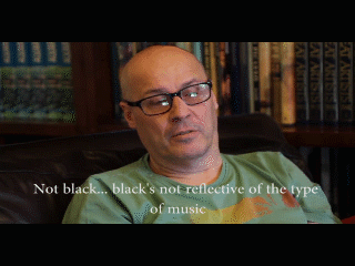 |
| One of our audience members commenting on the use of black as a background for our album art |
Would you buy it?:
Most of our audience members said that they would pick the album up and look at it, with one saying that they weren't sure, as they don't think it would grab their attention well enough.
All of the ones that said they would pick up the album, however, did say that they'd go home and research the band and their music before buying the album, as that is what they base their music purchasing choices on.
A summary of the improvements that the audience brought up:

Having said this, some of our audience did say that the album art was conventional for the genre, so we'd have to ensure that the changes made would not be so drastic as to ruin this effect.
The top three things I'd change if we could do it again:
Having listened to the feedback on our texts as they currently are, the 3 things I'd try to change are:
- Changing the colour scheme - I would probably use a brighter colour than black, perhaps trying either white/cream that P!ATD and San Cisco use, while making the rainbow-colours on the album art more vibrant.
- Make the website home page less busy - I'd place the banner on the home page itself, as 5SOS does, so that it is not distracting to the audience while they navigate through our website, although this would mean that they may not be as aware of our competition and tour pages.
- Try the band performance with only the lead singer directly addressing the camera - This would help the audience to identify the indie side of the band more easily, and was one of the things that they commented on.
No comments:
Post a Comment