


 |
| On our website we included a 'Music Video' page, helping to promote the music video to our audience. This would therefore aid they music video in its aim to promote our band's single. |
Band Identity:
Creating the band identities was crucial across all 3 of our texts, as we needed to ensure an appeal to the target audience of indie fans. To do this, we created the 'performer' image, then built on this to create the 'pop star' image that Richard Dyer refers to.
'Pop performer' image:
In order to create the 'pop star' image, we needed to first construct our band's persona within their music. Our music video was the main tool which we used to do this, using a narrative/performance hybrid in order to do this.
The band performance in the video was key to building our band's pop performer identity, as it showed them playing the music, with shots such as the ECU of Jacob displaying their passion for what they do.
 |
| Having these shots of Jacob is effective in appealing to the audience, as it presents him as passionate about his music, while also building his own performance style, making the band unique. |
 |
| Our wide shots show the band as unified, sharing the experience together. This would appeal to the audience, who like to see band interaction, and it is conventional for the indie genre (such as The 1975 and San Cisco). |
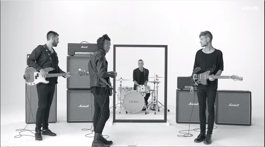 |
| A wide shot of the band in the 1975 video for 'Girls' |
 |
| Having the band smiling and playing their instruments connotes their individual enjoyment of music as well, which the audience can relate to, as they would consume music for a variety of experiences, i.e. escapism. Seeing the band members play the music for these reasons would help to make them more relatable to the audience. |
 |
| Our about page. The links to the individual band member pages are images of the band with their instruments, showing them to be performers, while their poses and facial expressions begin to connote their individual 'pop star' identities. We also included publicity shots of them with their instruments in the gallery. |
The album cover was also used slightly to create the 'pop performer' image, as although they are not shown to have their instruments, it is selling their music, so the audience associate the images they see on the back cover (serious facial expressions, conventional of indie-bands) to the music that is available on the album.
 |
| The back cover of the album presents all of the band, and the inclusion of this on the album would cause the audience to associate them with the music on the album. The sticky-tape style is also used in synergy with the website, helping to create a consistent brand identity. |
'Pop star' identity:
Throughout all of our products, the costume and make-up of our band members makes them seem quite clean-cut and innocent, acting as role models for younger fans (and likeable to the older indie audience), while the colour used helps to connote their playfulness as well. This creates a consistent band identity across all of our marketing platforms, and this would help the audience to more easily relate and aspire to our band.
We included 'About' pages on each of our band members, with little interviews with each of them. This would be effective as it would allow our audience to read the content easily, while giving them information about our band members, creating individual identities for each member, therefore making them seem more realistic.
For the construction of their pop-star identity, we used the website the most, and the inside cover of the digipak.
On our website, we included publicity shots of the band without their instruments to show the band's persona outside of their music, demonstrating their upbeat, happy, indie-pop image, and also their more serious side as well. This works in synergy with the inside cover of our digipak, which presents them as quite playful, quirky and outgoing, showing interaction between the band members as friends rather than in relation to their music.
 |
| An example of the publicity shots on our website. We use different backgrounds and costumes as well as the ones in the music video, in order to make the products seem unique when compared to each other, but the costumes are always similar enough to connote innocence, fun and the indie-pop genre. The pose here is quite playful, synergistic with the image on the inside cover of our digipak, which presents them similarly. |
 |
| The inside cover of our digipak. This works in synergy with our music video, as they are wearing the same costumes as in the band performance. |
Throughout all of our products, the costume and make-up of our band members makes them seem quite clean-cut and innocent, acting as role models for younger fans (and likeable to the older indie audience), while the colour used helps to connote their playfulness as well. This creates a consistent band identity across all of our marketing platforms, and this would help the audience to more easily relate and aspire to our band.
We included 'About' pages on each of our band members, with little interviews with each of them. This would be effective as it would allow our audience to read the content easily, while giving them information about our band members, creating individual identities for each member, therefore making them seem more realistic.
 |
| The About pages included images of each of the band members as well, connoting them as individuals within the band, i.e. Chrystal looks quite serious and calm, but her interview is still quite fun, while my character's picture shows me as quite eccentric, and so does my interview. This would be effective, as it shows the different personas within the band, allowing more for people to relate to, and therefore widening our audience reach. |
The inclusion of the blooper reel also helps to further their 'pop star' identity, as it shows them behind-the-scenes, allowing the audience to see them as the individuals on set rather than the pop-performers of the video.
 |
| The blooper page maintains synergy with the music video by including the different sets and costumes, but also makes the website into an individual product by including things such as the dancing in between costume changes, providing entertainment for the audience and reinforcing the star identity of the band. |
(Please note: The PowToon is only fully viewable with autoplay enabled, and if the PowToon does not load immediately, please refresh the page. Full screen viewing is advised, as the PowToon logo may obscure text in the regular viewing area.)
Brand identity:
Across all three platforms, we attempted to maintain a consistent brand identity that the audience would be able to recognise easily through synergy, and also symbiosis on the website.
On all three of our texts, we include the same band logo, creating an anchor for the brand identity, and the rainbow colour scheme and font make it stand out, so would be easily recognisable to the audience. On our website, the band logo remains on the page in order to strengthen the brand identity and recognisability, and it is also included on the merchandise in our store, to provide us with both purchasing opportunities for the audience, and promotion when they use our merchandise.
 |
| An image showing where the band logo is on each of our texts |
 |
| The band logo is on all of our merchandise, allowing the audience to feel a part of the fandom community after purchasing the products, and also providing us with possible word-of-mouth promotion when people see them in public. This is effective in widening our band's potential audience, and also our marketing's potential reach, as it inspires curiosity in the general public. |
We used repetition of the 'sticky-tape' style across our website and digipak, which created synergy between the two platforms. Originally this began on the website, thinking that it worked with the coloured-frames, and made the site synergistic with the home-made style of our music video, representing the indie-pop genre.
 |
| The sticky-tape style was used on both the album cover and the website, making the products synergistic, seeming very home-made and also quite innocent, while suiting the simplistic style of our brand. |
This motif is not seen on our music video however, so this feature does not create synergy between our ancillary texts and our main product, but it allows the music video to be an independent, distinct product from the other two, allowing it to promote the single effectively.
Our colour scheme is also consistent throughout all three products, using the colours from the different sets (blue, green, yellow, red, purple and white),
 |
| The consistent colour scheme brings synergy to our three texts, and helps to anchor the brand identity, as the audience will begin to associate this array of colours with our band. |
Below is a PowToon showing how 5SOS used synergy in their campaign in order to build brand identity, which we used as an influence when considering how we were going to construct our brand.
(Please note: The PowToon is only fully viewable with autoplay enabled, and if the PowToon does not load immediately, please refresh the page. Full screen viewing is advised, as the PowToon logo may obscure text in the regular viewing area.)
Symbiosis and more
On our website, we included links to sites such as ticketmaster and XFM's website. This was done in order to widen our record label's potential reach, and XFM are known for playing indie artists and bands who are up and coming, so would be an effective use of symbiosis as they have a suitable audience to expose our band to. |
| On our news page we also had a link to HMV, as we planned to have our band do a signing there. This would be good, as it targets the UK audience (Oxford Street HMV), and a large number of customers go to HMV to purchase music, so they are a valuable company in increasing our potential reach. |
 |
| Our XFM interview is advertised on our news page. We decided to have them appear on the radio's breakfast show, as this is a prime time slot, which has a large indie audience listening to it, so would be effective promotional exposure for our band and single. |
 |
| 5SOS include links to their social media on their home-page |

The social network newsfeed is on our home-page, which allows immediate, easy access to the social network for our audience, effectively encouraging them to interact with the content, i.e. sharing it to their own pages.
The content on our social network feed is also very inclusive of the audience, addressing them directly, which contributes to the sense of community for the audience, while simultaneously gratifying their need for surveillance of the band. (see right)
The social media was also used for the competition, compulsory for audience entry, so this would have worked effectively with the 16 to 25 year old indie fans, who are prolific users of social networks. This would have created word-of-mouth promotion for us as well, as fans would discuss with their friends what was going on with the band on social media, such as the competition and tour updates.
The competition also appeals to the prosumer aspect of our audience, who are able to produce their own content as well as consume due to technological convergence and the interactive nature of Web 2.0. This means that our competition would probably be effective with our target audience, as it allows them to share their creative content with the rest of the fandom community, as well as the band.
Having created strong brand and band identities, we needed to have purchasing opportunities available for the audience, as this maximises our record label's profits:
We have the album available for sale on our website, promoting the album alongside the album cover, as well as other merchandise such as T-shirts and backpacks (see in 'Pop Star identity' section).

As well as this, we have the tour page, on which we have information about tour dates to inform the audience, as well as links to ticketmaster to encourage them to purchase tickets for the tour right then. This would be beneficial to our record label as the audience would be more likely to purchase tickets, as they would not have to search for it themselves, or have to remember it later.
In hindsight, the inclusion of a final frame on our video, perhaps including the url of the website or 'Album available now', could have increased the effectiveness of our music video, and made it more synergistic with the website.
The social media was also used for the competition, compulsory for audience entry, so this would have worked effectively with the 16 to 25 year old indie fans, who are prolific users of social networks. This would have created word-of-mouth promotion for us as well, as fans would discuss with their friends what was going on with the band on social media, such as the competition and tour updates.
 |
| The competition utilises the social network of twitter, which is good for easily sharing content and promoting trending topics. If there is enough audience engagement, this could start a trend on twitter, bringing word-of-mouth promotion and possibly causing viral promotion of our band/album due to the fan videos being created. |
Having created strong brand and band identities, we needed to have purchasing opportunities available for the audience, as this maximises our record label's profits:
We have the album available for sale on our website, promoting the album alongside the album cover, as well as other merchandise such as T-shirts and backpacks (see in 'Pop Star identity' section).
As well as this, we have the tour page, on which we have information about tour dates to inform the audience, as well as links to ticketmaster to encourage them to purchase tickets for the tour right then. This would be beneficial to our record label as the audience would be more likely to purchase tickets, as they would not have to search for it themselves, or have to remember it later.
 |
| The 'buy tickets' button stands out clearly on the page, to draw the audience's attention to this purchasing opportunity. |
In hindsight, the inclusion of a final frame on our video, perhaps including the url of the website or 'Album available now', could have increased the effectiveness of our music video, and made it more synergistic with the website.
No comments:
Post a Comment